Help: Edmentum Graph & Data Plot
Jump to:
· Graph (x-y graphing)
· Data Plot (histogram & box plot)
Graph – Plot space
With Graph, you can plot data points and math relationships on the same coordinate grid in the plot space to the left. The example graph below plots and analyzes a marble’s arc through the air.
· black dots: x-y position data for the marble
· orange curve: a function plot that closely matches the data
· Whenever you plot a data set like these marble positions, the graph automatically scales to the data.
·
When just plotting
relationships, though, you’ll often want to use the Graph settings (“gear” icon
below the plot space) to adjust your graph position and scale.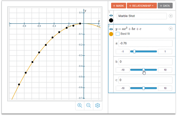
Graph – Control panel
Notice the following in the control panel, on the right side of the image above.
· Buttons at the top – You can add a labeled “mark” onto the plot space, define a mathematical relationship, or enter a data set.
· Data set example – You could click the “Marble Shot” box shown above to view or edit its data table.
· Relationship example – This relationship has three parameters you can control: a, b, and c
Graph – Relationships
· You can plot four common preset relationships on the graph (Linear, Exponential, Quadratic, Logarithmic) or you can define a “Custom” relationship.
· With preset relationships, you can choose “Best Fit” to automatically fit the relationship to any data set you have plotted. This calculates the best fit equation for the data and plots the best fit curve.
· Custom relationships allow you to define almost any x-y relationship you want. This includes non-functions (like circles or inequalities), like the first relationship shown below.
· The second relationship below is a custom function with two parameters that you can control.
·
Use the ![]() button to edit custom relationships.
button to edit custom relationships.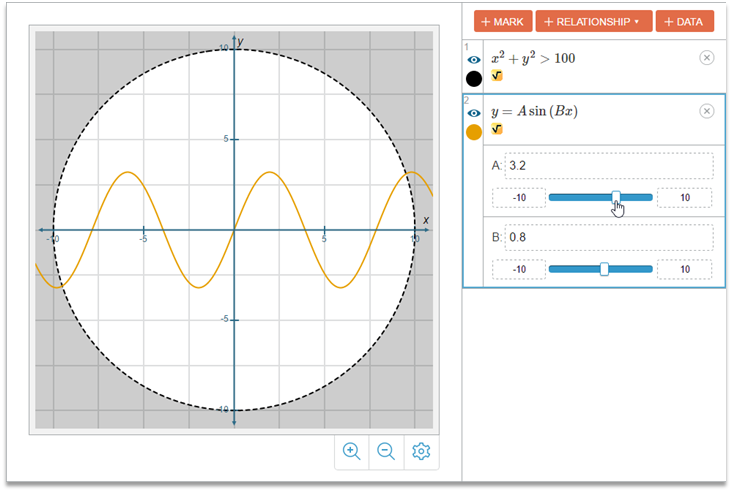
 Graph
– Data sets
Graph
– Data sets
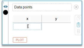
· You can type your own x-y data into the data table.
· Or you can copy two columns of data from a spreadsheet, select the first cell in the table, and just paste it in.
· You can also delete rows of data from the table by selecting them and clicking the pop-up trash icon that appears.
Graph – Reset button
Sometimes you just want to start all over. If you began your work with an “empty” Graph containing no data, marks, relationships, or images, the Reset button will reset to that state. If you opened up an activity with predefined set-up of data, relationships, etc., the Reset button will get you back to that original set-up.
Data Plot – Overview
With Data plot, you can plot and
analyze a set of “one-dimensional” (1D) data values. As an example, below you
see a set of temperature data recorded in the Twin Cities (MN) from 1873 to
2016. Each value is the average December temperature (F) for a specific year. There
are 144 data values in the data box—one for every year. At the top of the data
set you see the average December temperature in 1873: 17.6 F.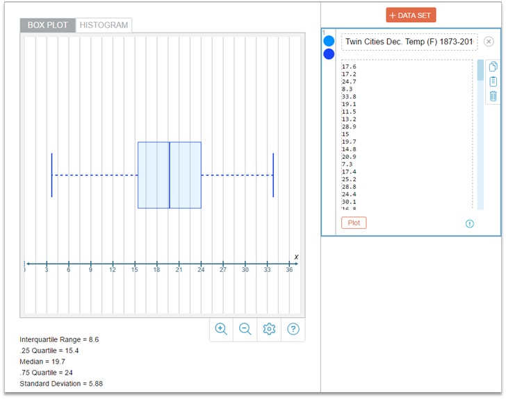
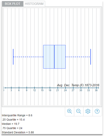
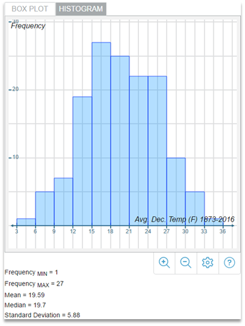
Data Plot – Box Plot and Histogram
With Data plot, you can visualize a 1D data set in two different ways: in a box plot or in a histogram. Each plot has different benefits, so it’s useful to see both views for a more complete picture of your data.
· Box plot (left image below) – Box plots display a quick summary of key data values. A vertical line in the middle marks the median value, the “box” shows the extent of the middle 50% of the data, and the “whiskers” show the extreme minimum and maximum values.
· Histogram (right image below) – Histograms don’t mark key statistical values, but they provide a good visual picture of the overall distribution of your entire data set by counting the frequency (number) of values that fall into equally-spaced “bins.”
 |
 |
||
Data Plot – Adding and editing data sets
· You can add a data set with the [+ Data Set] button at the top of the control panel.
· You can add multiple data sets (e.g. Global temperature in addition to Twin Cities) but for clarity and simplicity, you can only select one at a time in the control panel to display it in the plot space.
· You can type your own data into the data box or you can copy one column of data from a spreadsheet, tap into the table, and just paste it in.
· You can delete data values by selecting them and clicking the pop-up trash icon that appears.
Data Plot – Reset button
Sometimes you just want to start all over. If you began your work with an “empty” Data plot tool containing no data or display set-up, the Reset button will reset to that “empty” state. If you opened up an activity with a predefined data set-up, the Reset button will get you back to that original set-up.